OpenText RightFax
Digitally send and receive faxes at scale to modernize workflows

Overview
Fax remains a critical communication tool in many industries. However, traditional faxing methods are often associated with high costs, inefficiency and paper clutter.
OpenText™ RightFax™ lets users, applications and systems securely transmit paperless, digital faxes. This digital faxing solution greatly reduces the faxing costs by connecting to onsite analog or digital telephony, voice-over-IP or the cloud.
Why choose OpenText RightFax?
-
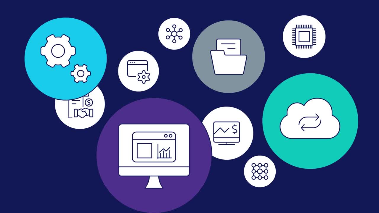
Seamless integrations
RightFax software seamlessly connects with ERP, EIM, EMR, CRM and legacy systems, including SAP, Oracle and Microsoft SharePoint.
-
Electronic Medical Records (EMR) capabilities
Leverage the most advanced custom integrations with RightFax and add secure digital fax functionality to leading EHR systems, including certified integrations with Epic and Allscripts.
-
Desktop print-to-fax and capture
Automatically route faxes to destinations wherever there is network access, such as personal or shared network folders, programs and document repositories.
-
Flexible deployment options
Choose from on-premises, hybrid and managed services deployments with enterprise-grade fax server support for all deployments
How RightFax can benefit businesses
Discover the advantages of using OpenText RightFax.
-

Accelerate modernization
Eliminate paper with an online fax service that digitally transforms corporate operations to cut costs, promote competitive difference and boost profitability.
-

Speed time-to-revenue
Reduce business cycle times and boost transaction speed by integrating with enterprise systems and automating manual fax processes.
-

Ensure compliance
Leverage security and auditing features that have received JITC certification to adhere to auditing functionality and business and governmental privacy laws.
-

Increase productivity
Enable fast, easy digital faxing within familiar email and desktop applications using custom integrations and workflows.
-

Reduce costs
Reduce errors and resolution costs and protect against data exposure and cyberattacks with RightFax software that eliminates manual handling of paper-based information.
-

Improve customer satisfaction
Automate to eliminate the guesswork and deliver accurate, reliable communications.
Features
-
Resilient, scalable performance
Modern architecture ensures business continuity with high-availability service and disaster recovery options.
-
Rich application integrations
Includes packaged integrations for OpenText platforms and leading industry applications.
-
Flexible deployment options
Offers multiple deployment options, including fully managed services, on-premises and hybrid, to meet today's business needs and evolve with them.
-
Visibility and analytics
Optimizes fax capacity and avoids bottlenecks with out-of-the box reporting and analytics using OpenText™ RightFax™ Analytics.
-
Value-add options
Offers add-on solutions to create a flexible, scalable infrastructure that meets all future needs.
-
Epic & Allscripts EMR certified integration
Offers paperless, easy-to-use digital faxing from EMR systems such as Epic and Allscripts, enabling cost reduction and increased HIPAA compliance.
Explore the advantages of our services
Deployment
OpenText offers a modern and comprehensive deployment option for RightFax.
- Extend your teamOff Cloud, on-premises software, managed by your organization or OpenText
Professional Services
OpenText Consulting Services combines end-to-end solution implementation with comprehensive technology services to help improve systems.
- Your journey to successOpenText Professional Services
- Drive deeper product adoption and richer engagementCustomer Success Services
- Accelerate the Information Management journeyConsulting Services
- Comprehensive Information Management services and resourcesExplore Professional Services
Partners
OpenText helps customers find the right solution, the right support and the right outcome.
- Search OpenText's partner directoryFind a Partner
- Industry leading organizations that enhance OpenText products and solutionsStrategic Partners
- Build better software productsOEM Solutions
- Explore OpenText's Partner solutions catalogApplication Marketplace
Training
OpenText Learning Services offers comprehensive enablement and learning programs to accelerate knowledge and skills.
- Meet the demands of all types of users for effective adoptionLearning Services
- Unlimited access to training with personalized tiers to fit your needsLearning Subscriptions
Communities
Explore our OpenText communities. Connect with individuals and companies to get insight and support. Get involved in the discussion.
- Explore ideas, join discussions and networkOpenText’s forums
Leaders trust OpenText
See how customers are succeeding with OpenText RightFax.
See more success storiesOCHIN optimizes patient information exchange with secure, centralized and integrated fax solution
Learn moreOpenText RightFax resources
OpenText digital fax solutions for Epic
Learn how OpenText digital fax solutions seamlessly integrate with Epic EMR
Read the overview